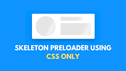
Hey friends and welcome to another project blogpost. Today we are going to see how to make this skeleton loading animation using HTML & CSS only.
First, let's see the general usage of this project. generally it's used as a preloader in website to indicate that certain parts/components of the page are loading and this preloader gives an visualization on how the loaded page will look like.
Now let's see the source codes.
Paste the codes below in your HTML file:
<!-- Created by CodingPorium,2021. Visit https://youtube.com/c/CodingPorium for more tutorials with free source code -->
<!DOCTYPE html>
<html lang="en">
<head>
    <meta charset="UTF-8">
    <meta http-equiv="X-UA-Compatible" content="IE=edge">
    <meta name="viewport" content="width=device-width, initial-scale=1.0">
    <title>CSS Skeleton Loading Animation | CodingPorium</title>
</head>
<style>
*,
*:before,
*:after{
    padding: 0;
    margin: 0;
    box-sizing: border-box;
}
body{
  background-color: dodgerblue;
  display: flex;
  height:100vh;
  justify-content: center;
  align-items:center;
}

.card{
  height:200px;
  width:500px;
  background-color: white;
  top:50%;
  left:50%;
  border-radius:8px;
  box-shadow: 0 15px 25px rgba(0,0,0,0.2);
  padding: 20px 30px;
}

.pic{
  position: relative;
  float:left;
  height:100%;
  width:36%;
  border-radius:50%;
}

h1{
  width:40%;
  height:30px;
  float:right;
  margin:5px 65px 0 0;
  border-radius:5px;
}

p{
  width:55%;
  height:95px;
  float:right;
  margin-top:20px;
  border-radius:5px;
}

.card *{
  background: linear-gradient(
    120deg,
    #e5e5e5 30%,
    #f2f2f2 38%,
    #f2f2f2 40%,
    #e5e5e5 48%
    );
  background-size:200% 100%;
  background-position: 100% 0;
  animation:load 2s infinite;
}

@keyframes load {
  100%{
    background-position: -100% 0;
  }
}
</style>
<body>
    <div class="card">
        <div class="pic"></div>
        <h1></h1>
        <p></p>
    </div>
</body>
</html>
And that's all for this project. Thanks for reading and do subscribe to our YouTube channel to support us.
Till the next one, goodbye!
Post a Comment